Cooking Project
Indie Game
Project Evaluation.
(1798 Words)
After inviting me to join his personal project following our success on our previous game jam, Tumblestone Fury, Sachit sent me a GGD detailing a new game concept. It was for a stylised cooking simulator in which the player can take on any role they choose at a restaurant- such as chef, waiter, bartender, etc. Each of these roles would have an ‘Overcooked’ style preparation gameplay loop.
As a developer, he needed game designers to help create concept art, level designs and assets. This project seemed like a lot of fun, so I decided to join his team and began working on it, alongside Meadow.
Sachit has expressed that this project is something we can work on casually alongside our university submissions and has been very understanding about our submission deadlines. He has a time frame in which he’d like the project to be released, so we are all working towards that. Once I have finished my university submissions I will begin working on this project more consistently, however for the time being I have not made a specific time management graph and I have been creating assets and level designs when Sachit asks or during my spare time – then sending them to the team for approval.
Competitors:
Since this project will be published on Steam, it is important to consider our competitors.
_____________________________________________
Overcooked:
I have researched a fast-paced cooking game with a similar gameplay loop called Overcooked.
Overcooked would be one of our main competitors. Hopefully fans of Overcooked will want to play something similar and would give our title a try. Unlike Overcooked, our game allows players to take up a variety of different roles in the restaurant. This may intrigue players who enjoyed Overcooked but want more variety in gameplay.
Our game is single player, which may attract a different audience than Overcooked, however it may also make players who enjoy the social aspects of local multiplayer not as interested. Jiang (2020) identifies the couch coop element of Overcooked is one of the factors which made it a success, however she suggests this isn’t the only reason for the game’s popularity, she also cites the unpredictability and chaotic nature of the game design and preparing the orders – this is an aspect we plan to include in our game as well.
_____________________________________________
_____________________________________________
PlateUp!:
Plate Up!
There is a similar food preparation game available called Plate Up.
Due to its similarities, Plate Up would also be one of our competitors. Plate Up is more manual than Overcooked, since players must take orders themselves – this is similar to our ‘waiter’ role, taking orders and bringing the finished dishes to the correct tables. However, our variety in job roles may entice players to choose our game over Plate Up, as well as our more affordable pricing. We are currently aiming to price the game around £5 -£8 whereas Plate Up is currently £34.99 on the Switch.
_____________________________________________
Game Concept:
For the game concept, we brainstormed together and decided that the player should have to unlock each ‘role’ through expanding their restaurant by performing well at their job. We wanted the player to be able to pick which job they started with but how would they know which job they preferred without trying them first? We used the narrative to work around this issue.
_____________________________________________
Narrative Concept.
The default player is a dog who applies to work at a failing restaurant. All of the other staff have already jumped ship except for the boss who eagerly accepts the player’s help. Since there are no other staff members available, the player must take on the roles of all staff. This allows them to trial each job throughout the week.
Despite the player’s hard work, the restaurant fails the weekly inspection and closes. After seeing how enthusiastic and hardworking the player was during their first week, the boss asks them to join them at a new, smaller, restaurant location, the choices being:
- A pub which would have both the bartender and chef roles available.
- A café bar which would have both bartender and waiter roles available.
- Takeout which solely has the chef role on offer.
- Fast food which also only has the chef role but is a faster paced for more of a challenge.
Once the player picks a starting establishment, they work their allocated job. At the end of each week, they have a review which shows how well they performed throughout the week and will eventually allow them to upgrade the restaurant to unlock the other job roles.
_____________________________________________
With the basic gameplay loop decided, I moved onto character design.
Character Design:
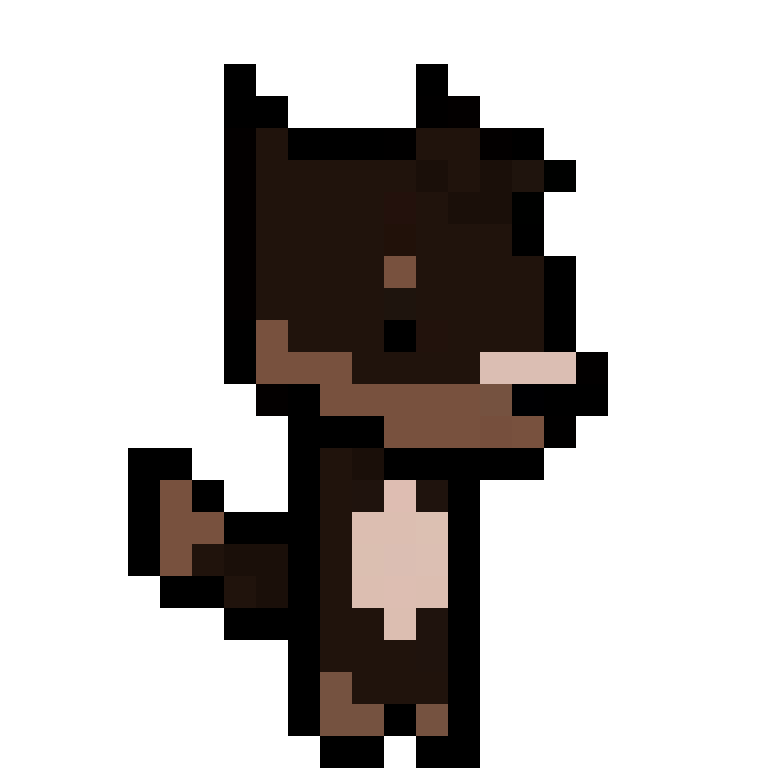
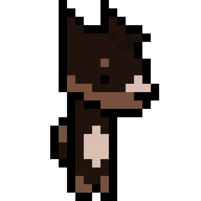
After speaking with Sachit, we decided to have multiple playable characters with a character selection menu. To exaggerate the quirky, stylised art direction of the game, we decided to have animals working in the restaurant. We wanted to design and animate four playable animal characters, both Meadow and I creating two each. Sachit sent us the placeholder dinosaur sprites he was using so we could use them as inspiration. We discussed which animals we should include, eventually decided on a dog, cat, polar bear, and alligator – keeping all the creatures very visually different and interesting. Like stated previously, we thought that the dog could be the default player character.
I drew some initial sketches trying to match the big head, small body proportions of the dinosaur sprites. However, once Meadow sent me her sketches I decided to try and match her designs to maintain the style and for consistency.
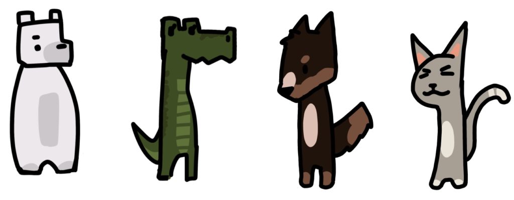
I experimented with two colour pallets for the dog character before deciding on his final design. The cat’s design was a similar process although I created more sketches trying to finalise the design. I exaggerated certain features, such as whiskers, tall cat ears, big eyebrows, a round body and many other versions. Eventually I decided on the long body, big ears look for the cat and did a few colour pallet experiments. I decided on the grey design and moved onto the pixel art versions.
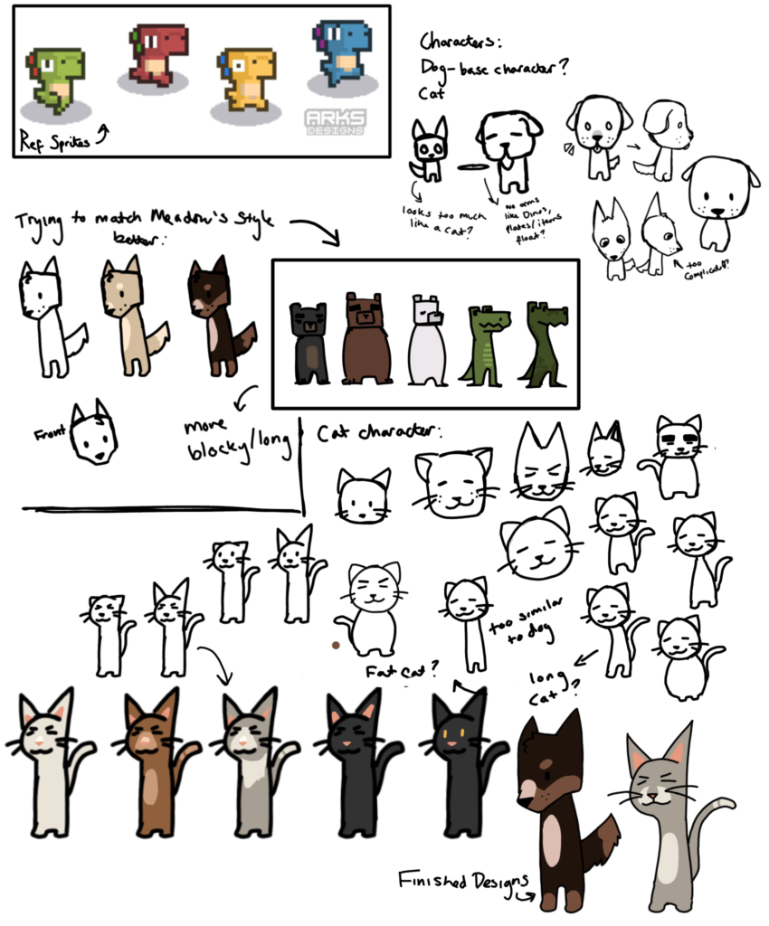
Pixel art versions:
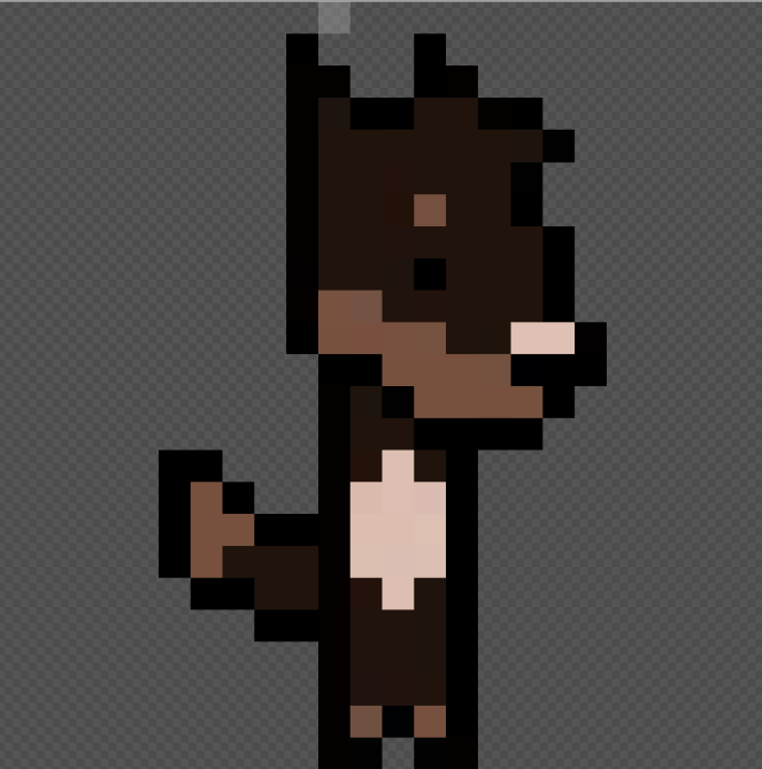
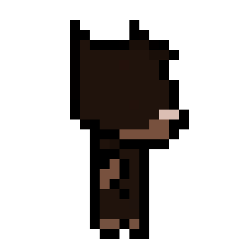
For these characters we decided to try working in 24 x 24 pixel art dimensions since this was the size of the example dinosaurs. Since these would not be humanoid characters, we thought this would be a good introduction to smaller sprites while not having to maintain human proportions. Conveying human proportions can be difficult when working with small dimensions, as I learnt during my game jam project. The dog design was relatively easy to translate into a pixel art style.
The original design for the cat had lots of curved lines which did not translate well into pixel art and its face was far too complicated for its small head. I had to revise the design while creating the character sprite to fix these issues. Overall, I was disappointed with the cat design. I sent the designs to Sachit for feedback, telling him the issues I’d had with the cat figure. He suggested that I pick an animal which was easier to exaggerate, however, he said that three animals were enough for now and suggested we move onto the animations.
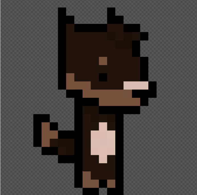
Dog Sprite Animations:
After importing the initial design into my animation software, I made some changes. I made the character’s head and body wider to fill more of the canvas.
Walk Cycle:
I started by animating a walk cycle for the dog character. I made two versions, a very simplified bob up and down animation and a more complicated cycle. The second looked much smoother and we all preferred it. After a few more tweaks, such as making the hair bounce to add some more ‘life’ into the animation, I moved onto the idle animation.

Idle Animation:
The idle animation had many revisions, mainly because I wanted to make the dog’s head bob more regularly than the other characters to make him look energetic. This idle animation went through lots of changes with helpful feedback from my team on how to improve it, eventually we settled on this, however, I still was not satisfied with the result.


A few days later, with a fresh set of eyes, I went back to the idle animation and made some changes. One has the ears moving at the same speed as the head bob, and one has the ears one frame delayed making it less uniform and more natural. Both of these animations look better than the original ‘finished’ idle and I am glad that I took the time to tweak the design.

(The animation on the left has faster ear and hair movements while the on the right is one frame slower).
Back facing versions:
For both the walk and idle animation I created a back and front version for when the player turns around – the dog’s wagging tail detail was especially well received by my team.

Final Animations:
Here are all the finished animations together:


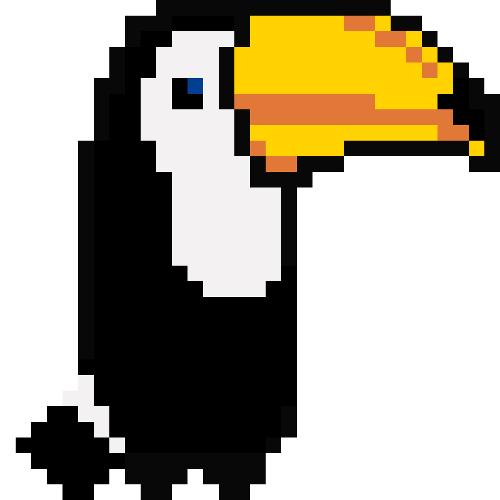
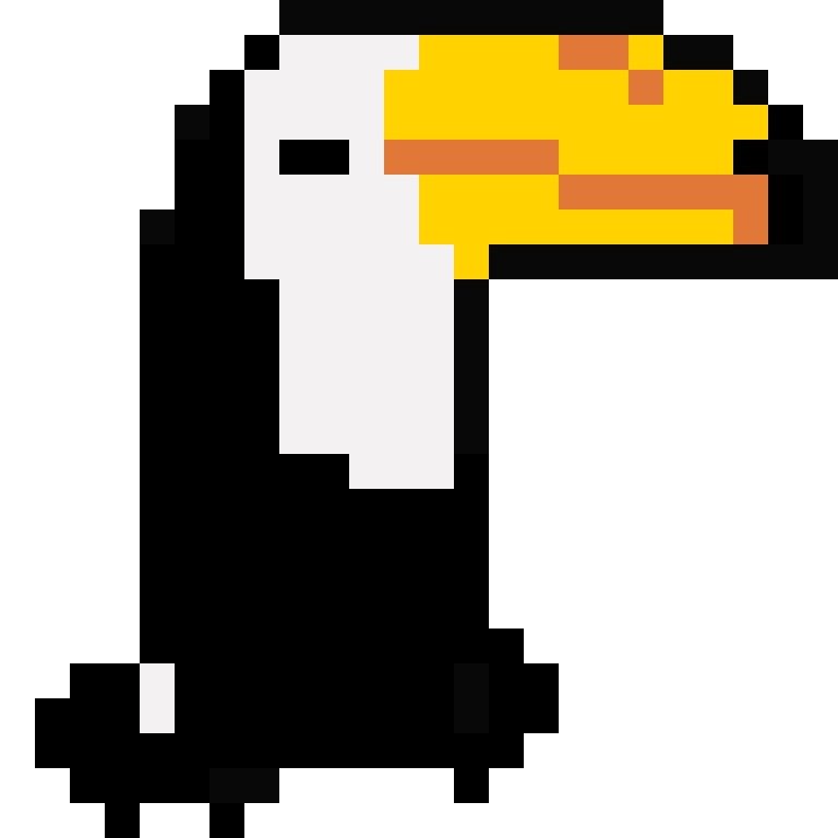
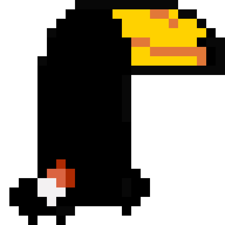
Toucan Design:
For the second animal, I stepped away from a cat design and brainstormed with my team. We wanted all the playable animals to be either carnivores or omnivores since they would most likely be cooking meat. To visually differentiate them from one another, we needed the colour pallets to be distinct and visually different.
After brainstorming a few different possibilities, we eventually decided on a toucan. We thought the toucan’s variety of colours and unique beak shape would make it distinct enough from the other characters.
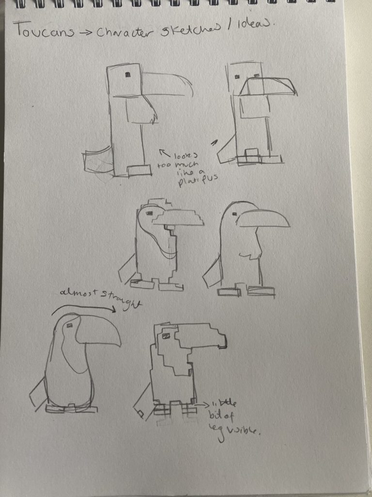
I drew some rough sketches in a notepad before moving on to creating the sprites.
Idle Animation:
I was very happy with how this toucan animation turned out.
This was the first animation I created, however, I quickly realised I had accidently animated the sprite in 32 x 32 pixels rather than 24 x 24 so I had to begin again. My team liked the squash and stretch technique that I had used for the toucan and suggested I make him blink for a frame.
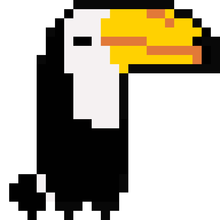
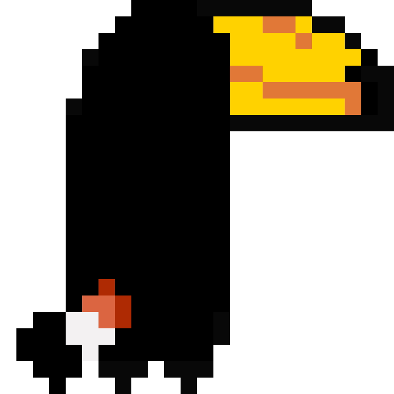
Back facing idle:
I created the back facing idle however it was suggested that I should add some red to the base of his tail, so I did in an almost ombre style, purely for aesthetic reasons.
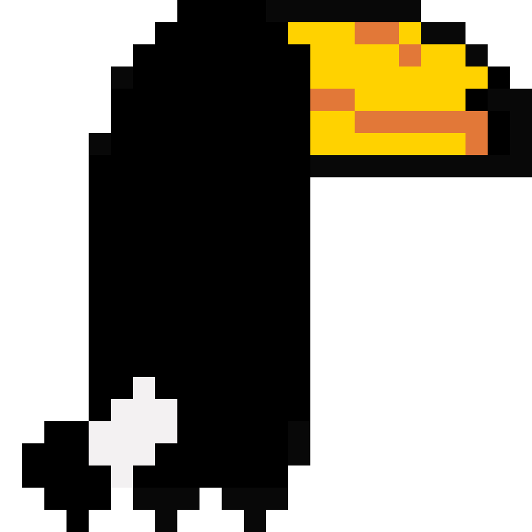
Walk Cycle:
Since this character’s body is solid black, animating the walk was more difficult than with the dog character. If the legs overlapped, they became indistinguishable. I combatted this by removing the body squash and stretch for this walking animation and just focusing on the leg movement. I kept the squash and stretch technique on the idle animation only.
Final Animations:
Here are all the finished animations:


Layout designs:
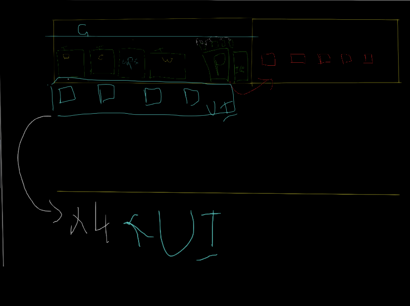
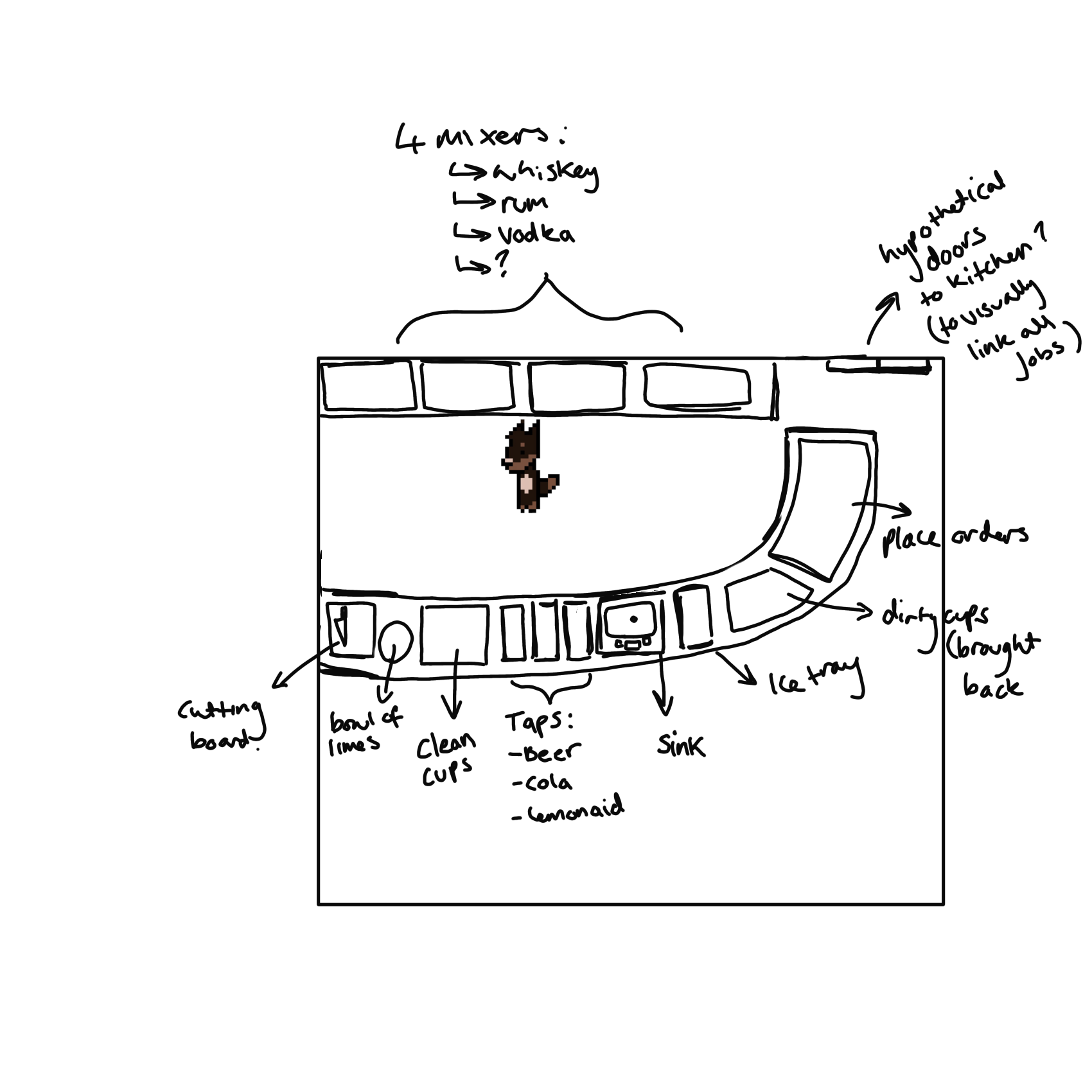
I was also asked to create some rough sketches for the bartender gameplay layout. In a meeting Sachit had created some sketches while we brainstormed, however, we were all confused when trying to decipher what we meant by lots of elements.
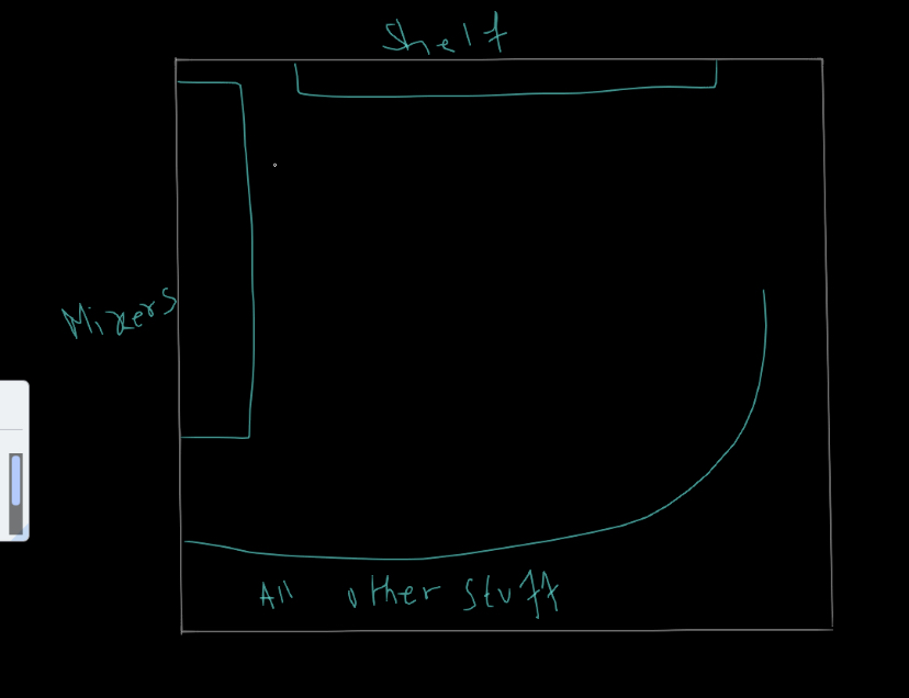
I remembered that Sachit suggested the alcoholic mixers be under the bar, accessible via a popup UI menu, however after sketching out the layout, I felt this may be a little overwhelming.
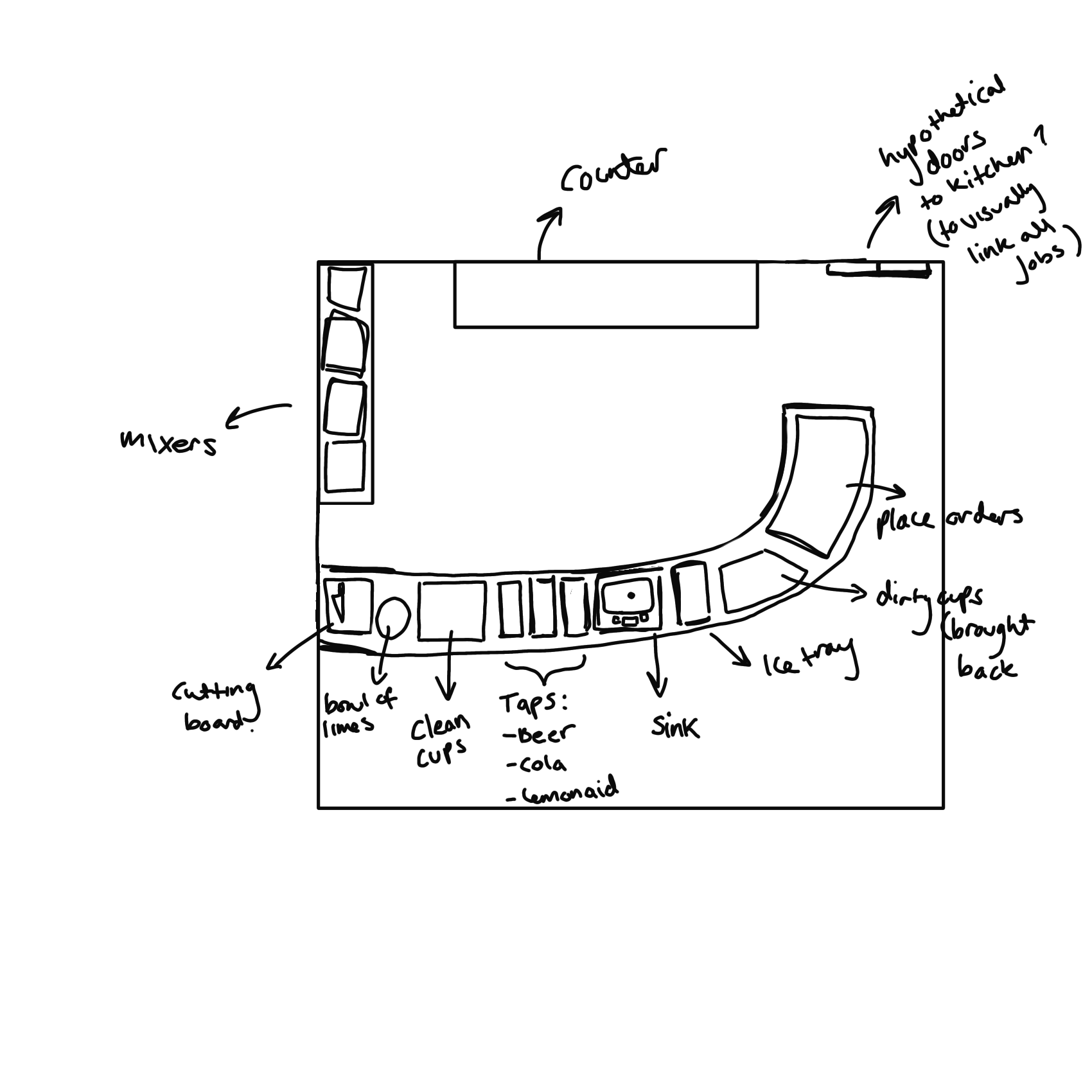
I created another design in which there was a wall of drinks behind the bar like in some reference images I found.
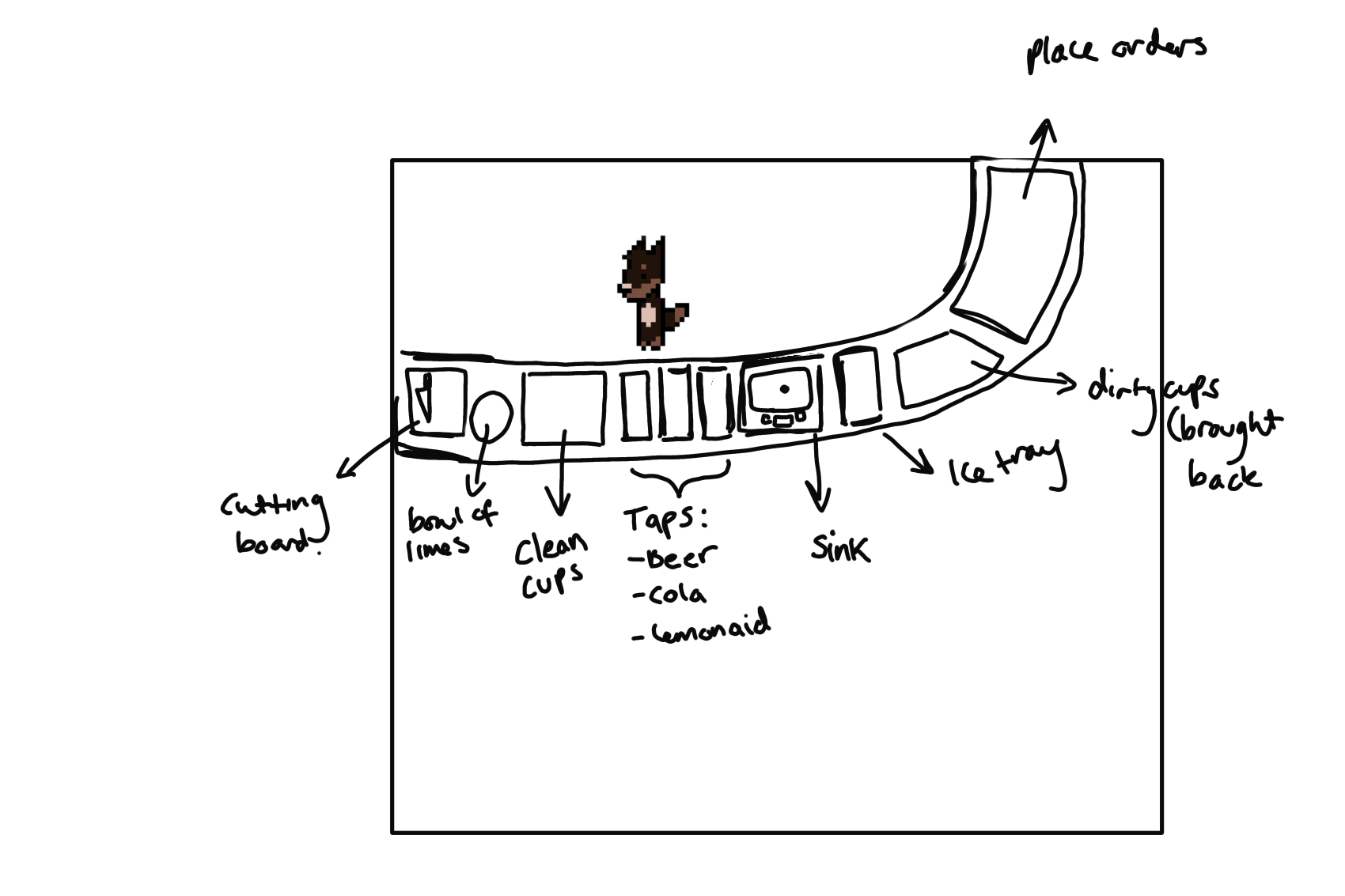
Doing my best to remember our original plan, I drew a quick sketch of a possible layout, being careful to include all the elements we wanted for the bartender role: a cutting board (for sliced fruit in the drinks), bowl of limes, space for clean cups, taps (for beer, lemonade and cola), sink (to wash dirty cups), icetray, used cup space and the order window.
Sachit liked this idea, however suggested I put the bottle wall on the left rather than behind the bar, having a preparation shelf be in its original place. (He sent this sketch to explain his idea).
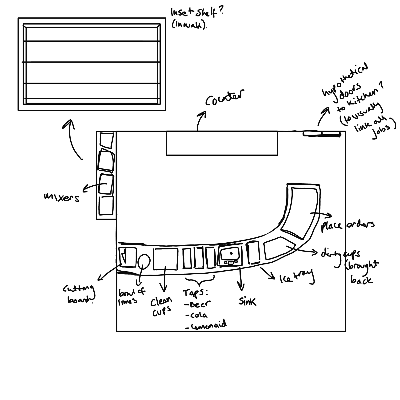
I created two new versions, both with the bottle wall in is suggested location but one where it is inset and one where it is not. However, looking at the current camera angle for the game I am unsure if an inset shelf would work unless it were on the visible wall.
Final Thoughts:
Overall, this project is going very smoothly. I feel the three of us work well as a team and have good communication and similar ideas. I am excited to continue this project in the future! I will continue working on this project up until and past submission.
