Tumblestone Fury
Game Jam
Project Evaluation.
(578 Words)
After seeing our work on the previous game jam our lecturer, Sachit Nanajkar asked if we would help with his own current game jam entry.
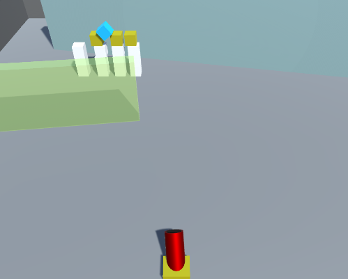
This game jam prompt was ‘falling’ and Sachit had already decided on the game concept and had begun development. It was a top-down angle game where the player must shoot structures with a cannon, the main inspiration for his concept was Angry Birds.
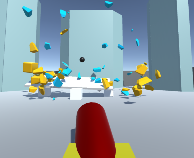
We had a meeting with Sachit in which he asked how we thought he could visually improve the game. I suggested changing the perspective to be a low angle camera fixed with the cannon being able to move across the screen. This low angle would make the player look up at the looming structures and make the destruction feel a lot more impactful. We brainstormed a few more ideas in person and then I began to create some designs.
Due to the project only having four days remaining, I decided rather than planning a specific task for each day, I would make a list of tasks that need to be completed. From this list, I could tick off the tasks that I had completed after prioritising them.
Most important
Level design sketches
Gameplay sketches
UI asset creation
Font creation
Least important
Since it included further developing the visual style the game, I started with the gameplay sketches.
Initial sketches:
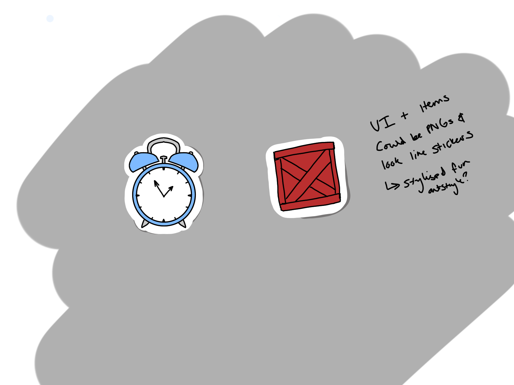
I showed my suggested perspective and added some aspects from our brainstorming session, such as floating time bonuses and TNT boxes.
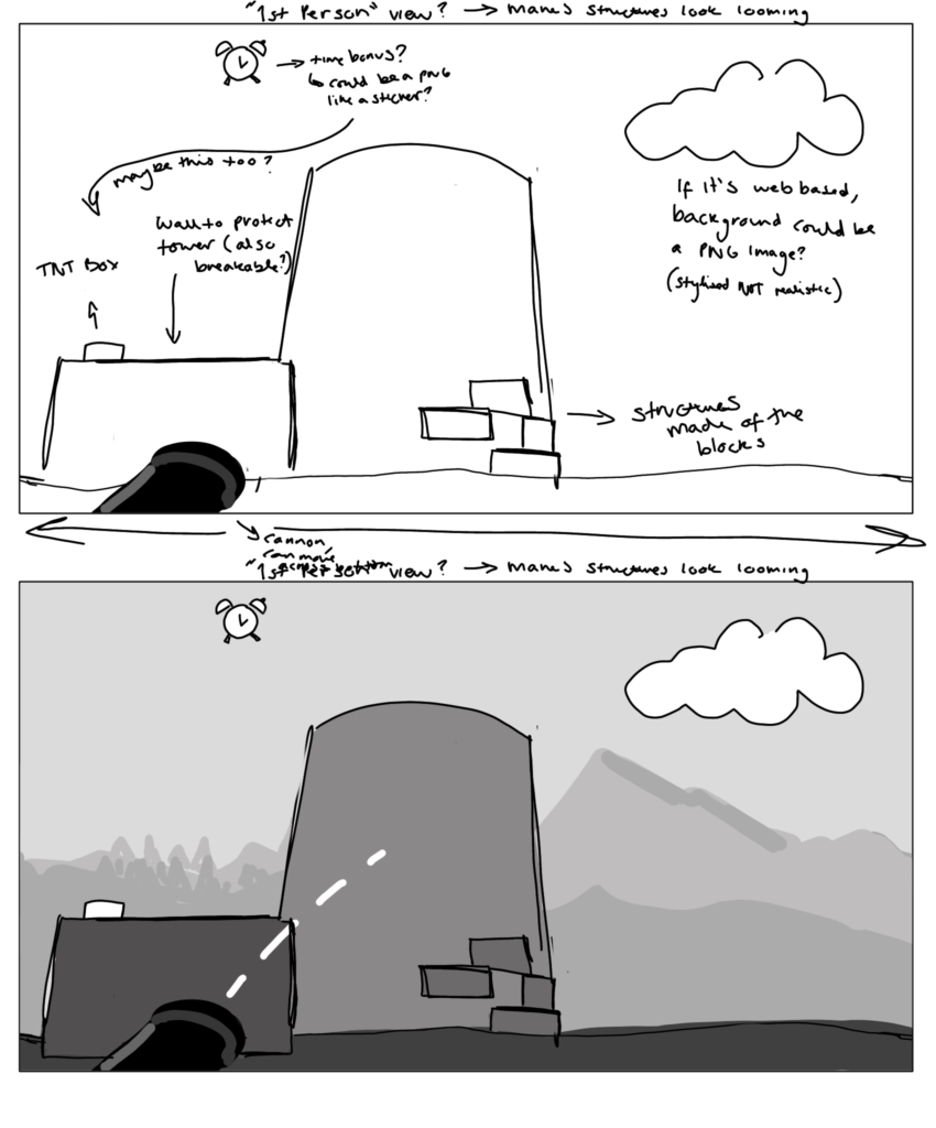
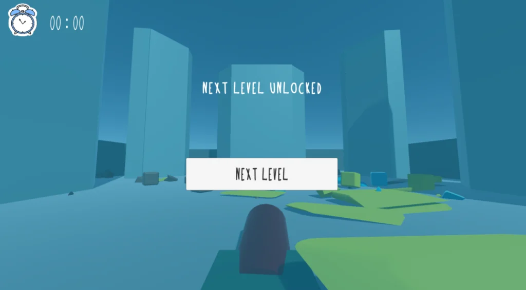
Sachit liked these ideas, however he suggested that the TNT should not be a sticker asset, but agreed that the clock could be. I created a high-fidelity version of the sticker, having a slight shadow to give depth. I also created one dot for a dotted line aim sight. I made it slightly diagonal so it would link up asymmetrically and look more playful.

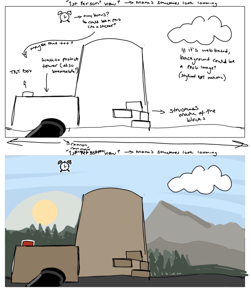
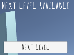
In the coloured version of the sketch, I gave the TNT box and clock a white outline. I explained this further with another sketch, suggesting they could look like stickers and be 2D assets since the gameplay seemed like a child playing with toy blocks. I suggested a playful, scrapbook style visual design for the game UI to fit this theme. Since I have prior experience with making custom fonts for games, I made one for this game to fit this aesthetic.
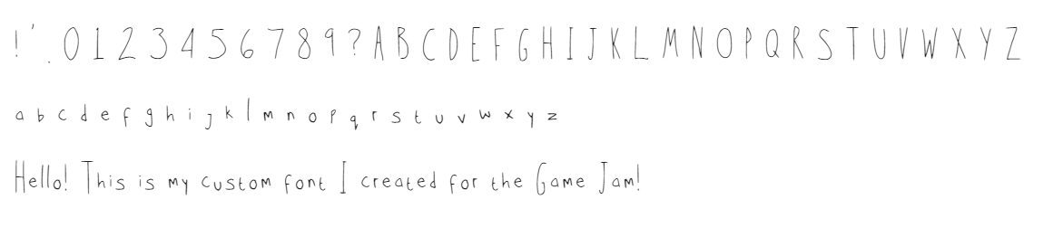
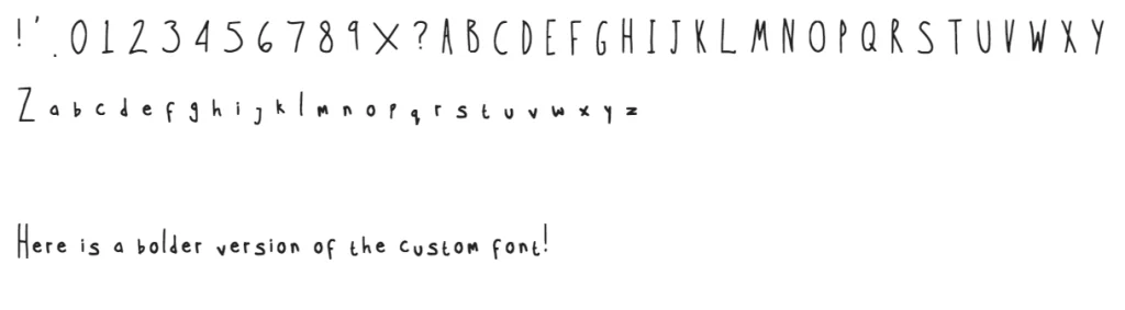
Font Creation:
After this, I created the font. I made this font elongated and slightly wonky to further the playful, childish aesthetic. Once implemented into the game, Sachit felt the font was a little too thin so he requested that I make another. I traced over the characters with a thicker pen size and re-sent the font and it was much more legible in game.
Level Design:
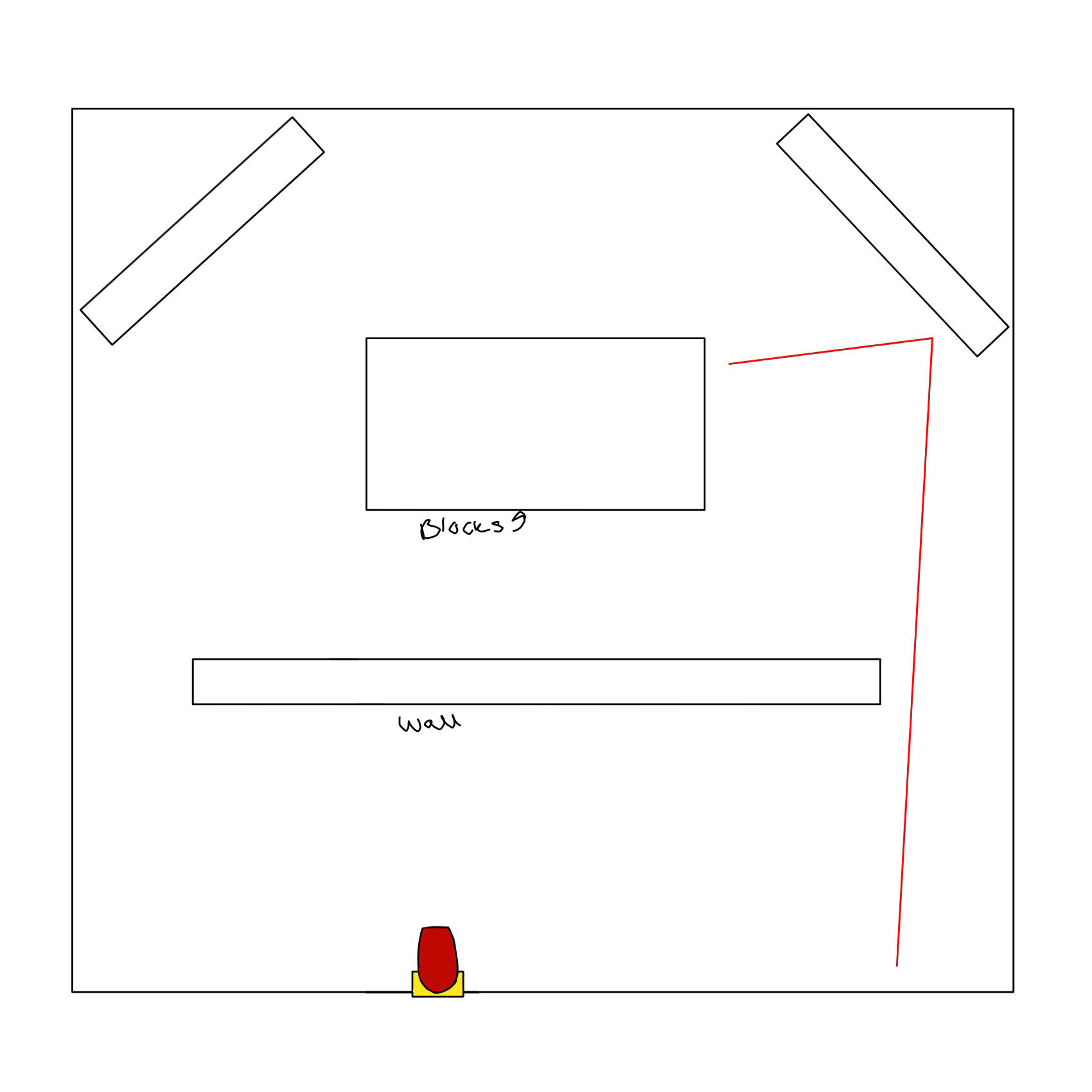
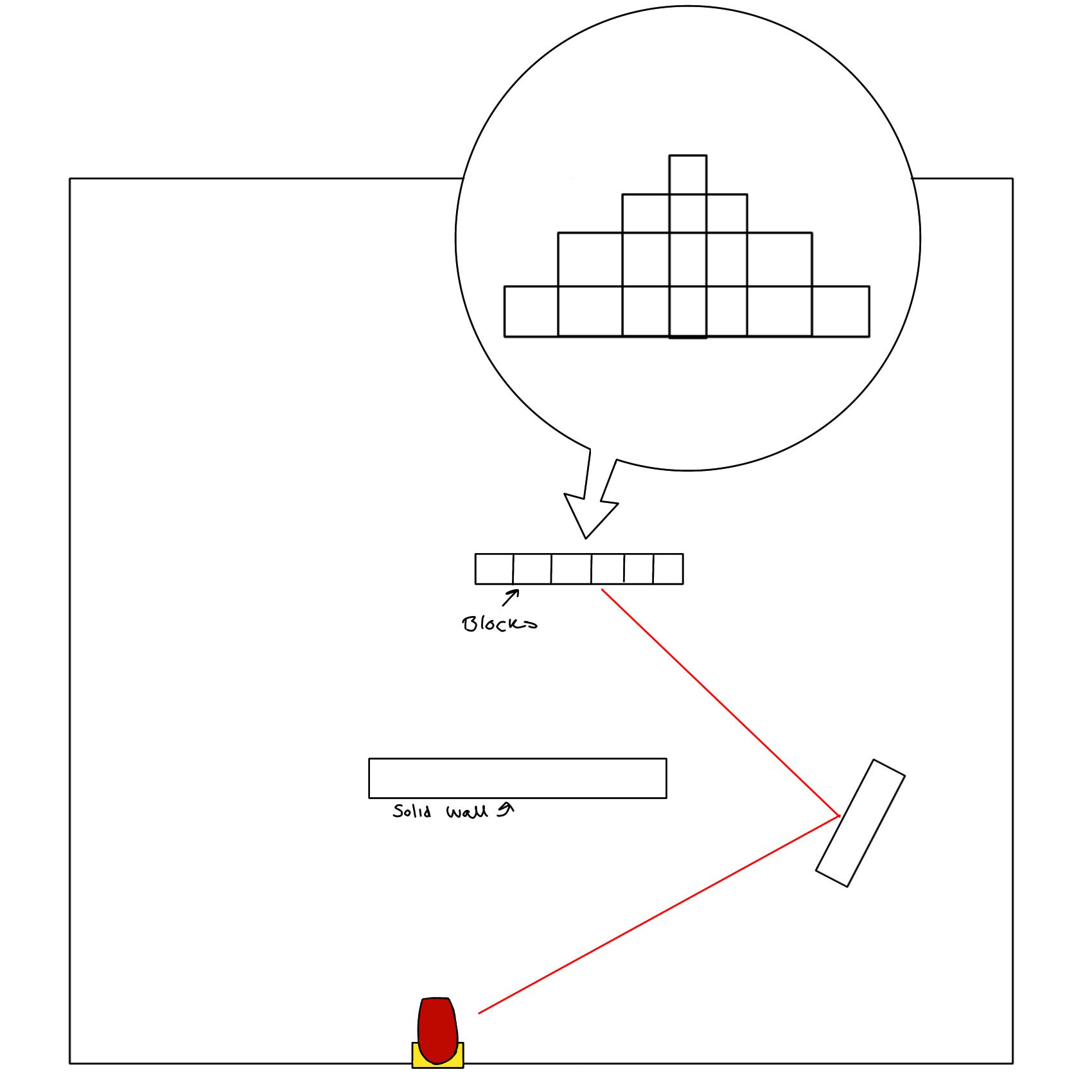
After this, Sachit asked if we could create some designs for ricochet levels. I created two sketches focusing on ricochet gameplay and showing where the impact must be to successfully complete the levels. I sent these level designs to Sachit to be used as a block out for the game.
_____________________________________________
Final Thoughts:
Joining this game jam four days before the end was challenging however, I feel I managed to aid the project through my game design knowledge and assets. I also play tested the game and provided feedback as a player which was fun! I feel this project was successful and that we worked well as a team.
After our work on this game jam, Sachit offered us an opportunity to be a part of his personal project which I have also included as a part of my DM3103 project write up.
_____________________________________________
If you’d like to play the game, click here: