Room 101
Game Jam
Project Evaluation.
(1381 Words)
I decided to participate in the Brackeys Game Jam 2024 alongside two other students, Meadow and Youngju. The theme for this Game Jam was ‘What’s Behind The Door?’.
The three of us brainstormed together, our two initial ideas being a horror genre game or a portal style game. We eventually decided on a 2D side scroller horror puzzle game set in an abandoned apartment complex.
_____________________________________________
Narrative Concept.
The player is a landlord who carelessly evicted all of his tenants with plans to demolish the apartment complex. The landlord is trapped in a strange dimension as punishment for carelessness towards the tenants. Their pain has manifested as monsters sent to torment him. The objective is to reach Room 101 to escape, however he cannot find the key and must search the other apartments, which he discovers are inhabited by humanoid monsters which represent previous tenants.
Throughout each level / apartment, the player will learn more about the tenants and their lives, forcing the landlord rethink his treatment of them. Each level is completed by finding a personal item belonging to the tenants, left behind when they were evicted. The monsters are then confronted with these items and reminded of their humanity, dissipating their rage and ‘defeating’ them. The last room the player faces is Room 101, which is revealed to be the landlord’s own apartment. Rather than a tenant, this room has a monster version of himself which he must defeat, confronting his own greed and coming face to face with the monster he had previously been.
_____________________________________________
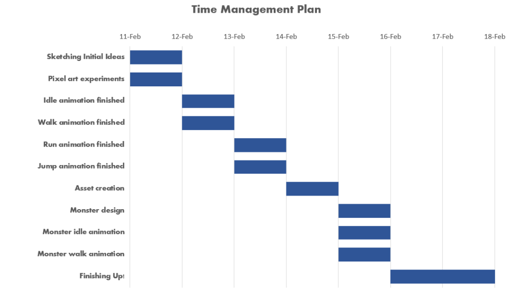
Time Management.
Due to the game jam spanning only one week, time management was crucial to ensure my assets were completed with enough time for Youngju to implement them into the project. I allocated one day for each task due to the time constraints. I wanted to have the character designed by the end of the first day so I could move onto the animations on the second day, hoping to have these all finished and sent to Younju by the third day.
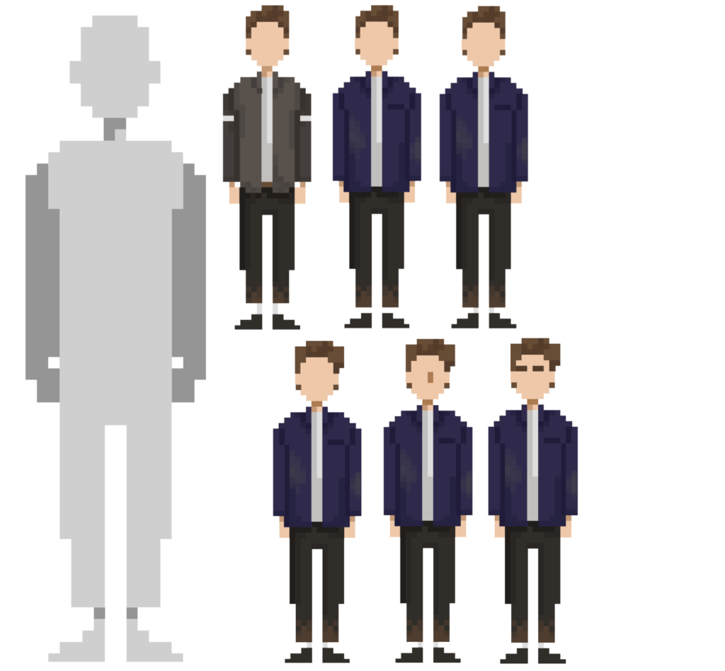
We decided on a pixel art style. Youngju, the team’s developer, suggested it due to our prior experience with pixel sprites.
I was tasked with designing and animating the main playable character and the final opponent monster. The final monster would be a parallel of the landlord rather than the tenants so I would create both designs to keep them consistent.
I started by doing some sketches on paper. At this stage, we decided to create the sprites in 32 x 32 pixel dimensions so I experimented with blocky designs and the realistic human equivalents, keeping the shapes simple yet readable.
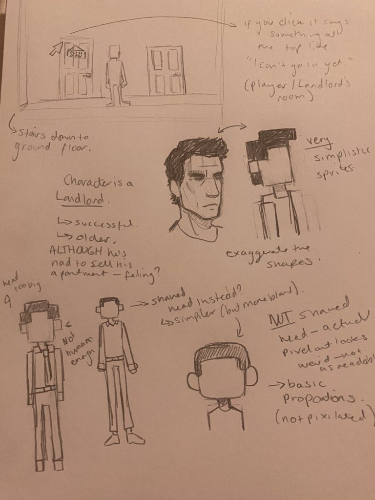
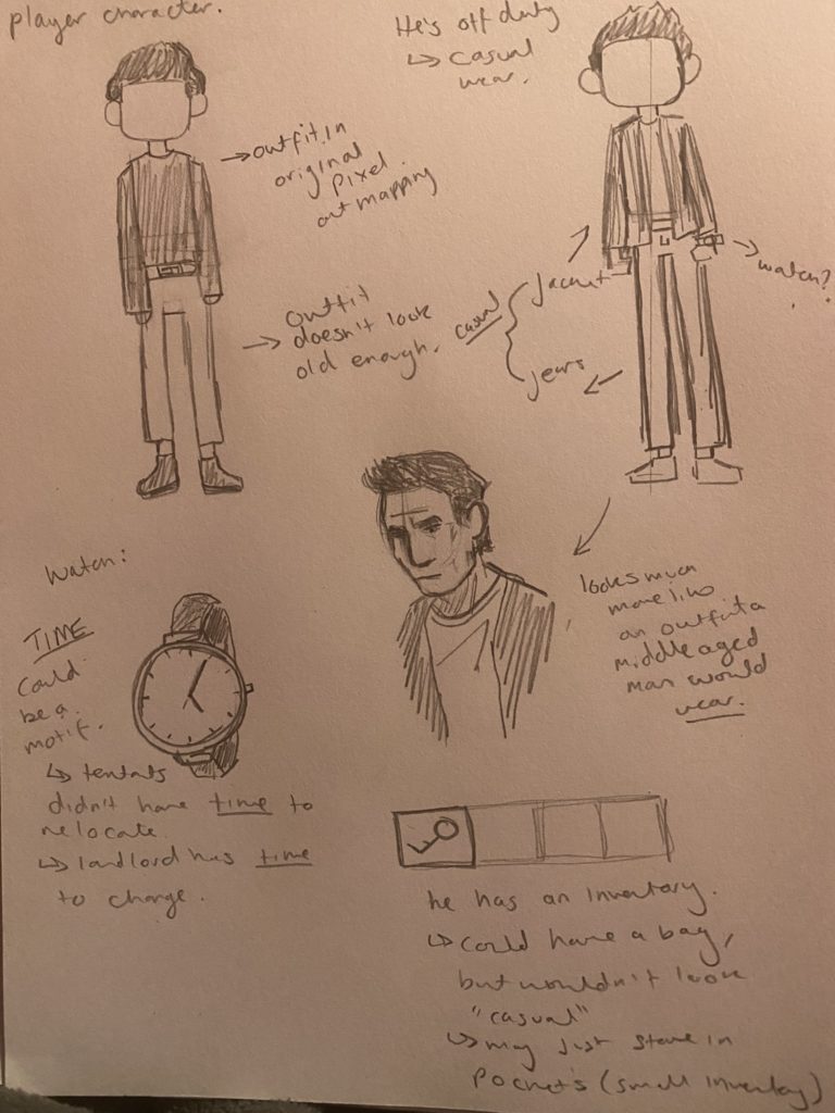
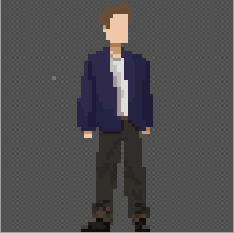
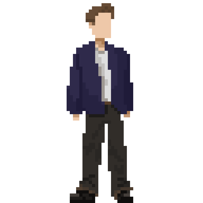
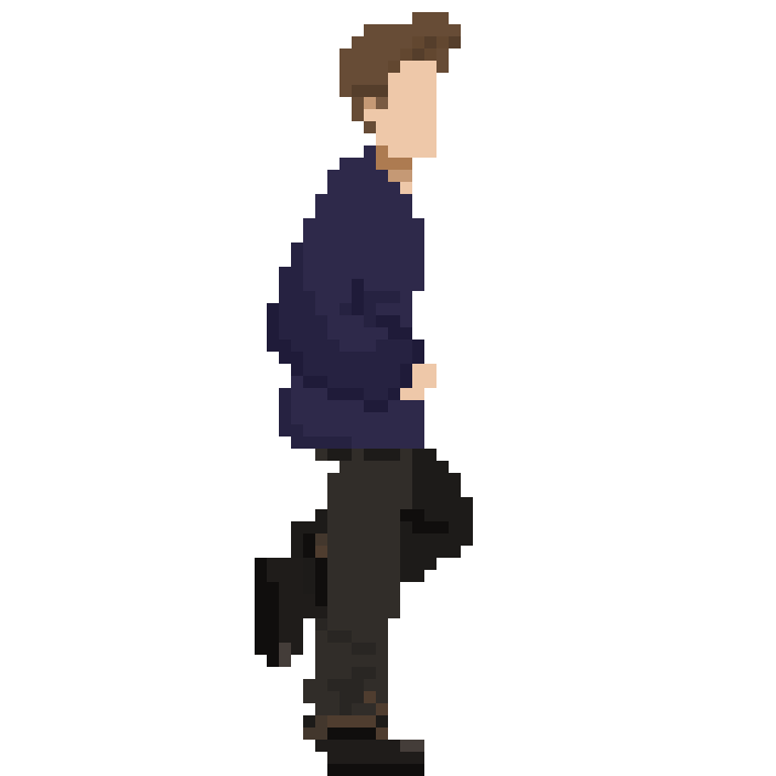
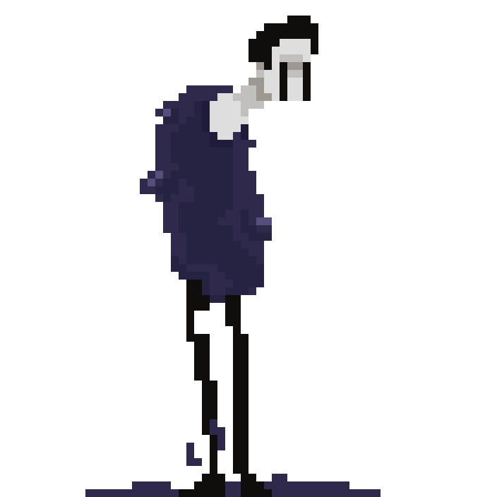
For the main character’s design, I played into the horror game trope of having a white, middle aged, male protagonist (Stewart, 2022). Being older also worked narratively since he is a landlord / property owner. The pixel art variant would have no face to allow the player to project onto him.
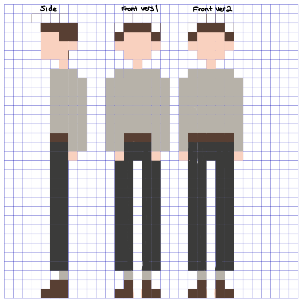
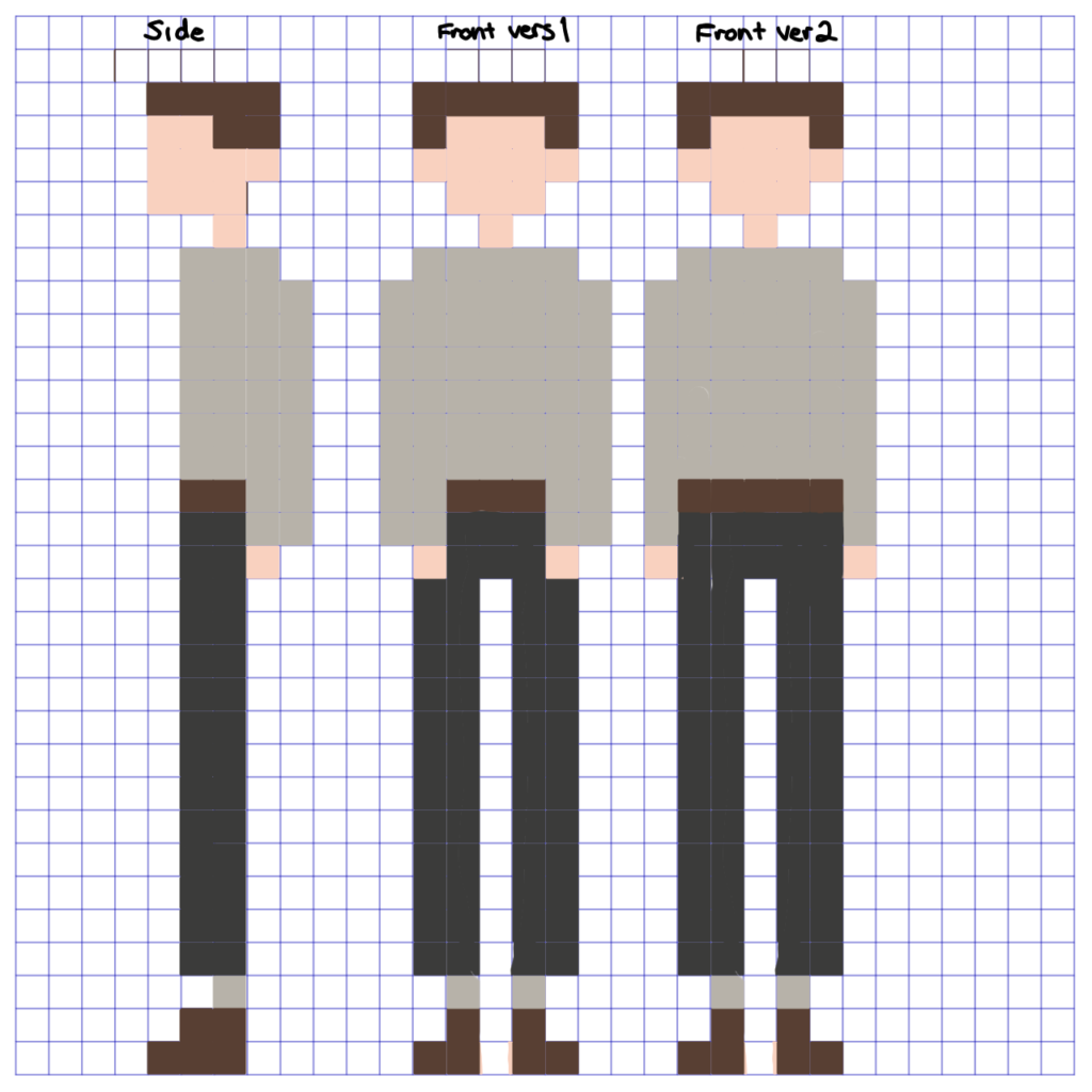
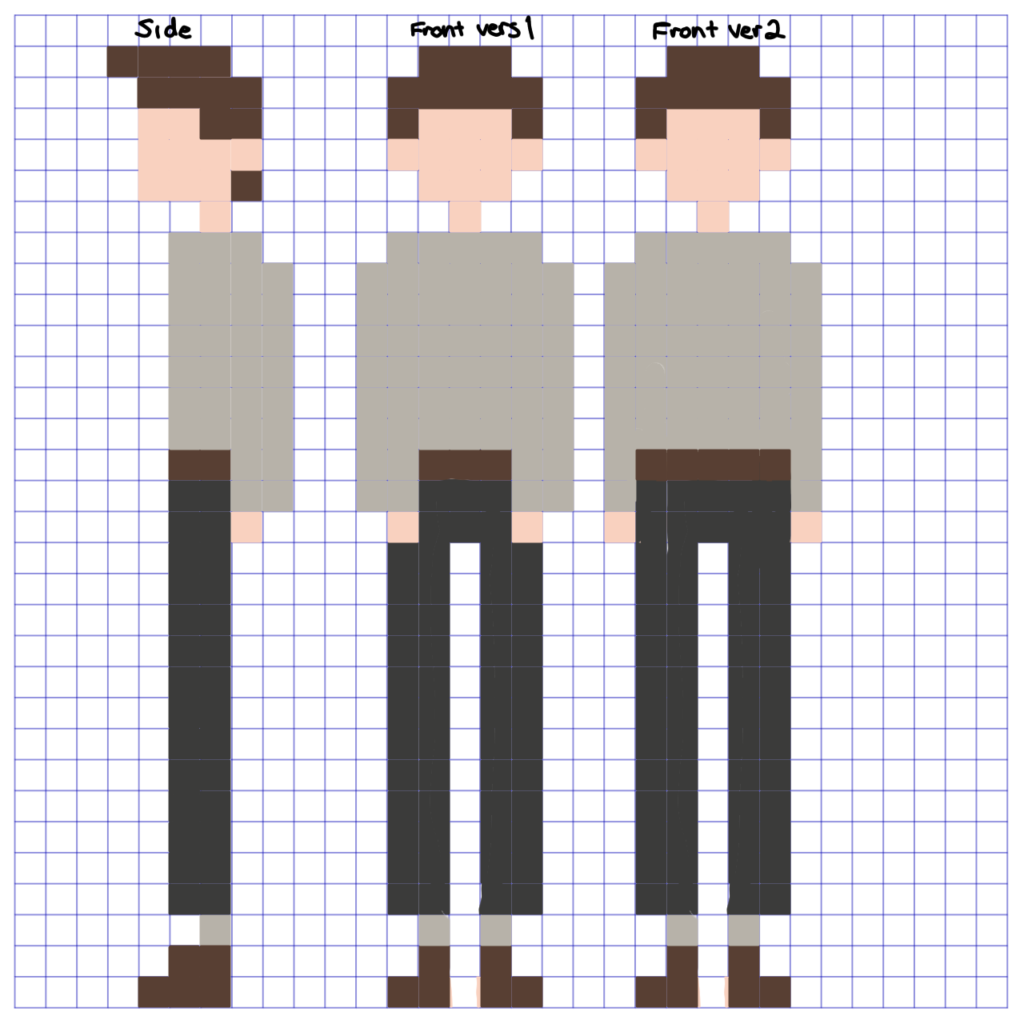
I drew some simple humanoid figures out of cubes and straight lines. I thought this design would translate well into pixel art however this was much more difficult that I initially thought. The longer hairstyle translated best; however, I still was not satisfied with the design. Meadow and I decided to increase the sprite size. Originally, I was working in 32 x 32 dimensions which was a big leap from what I typically use, 128 x 128. I increased the size to 64 x 64 for the main character to push myself slightly out my comfort zone while not being such a drastic change in pixel size.
Digital Designs:
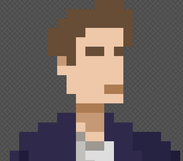
I created a base and did some colour experiments, I experimented with giving him some different styles of facial hair to make him look older as well as other hairstyles and head shapes – trialling nose placement and eyebrows to give his face extra definition.
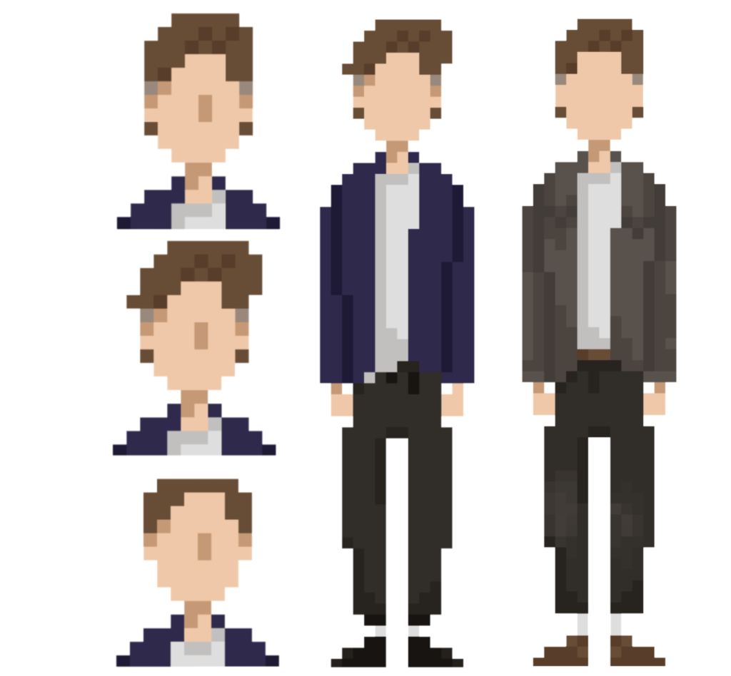
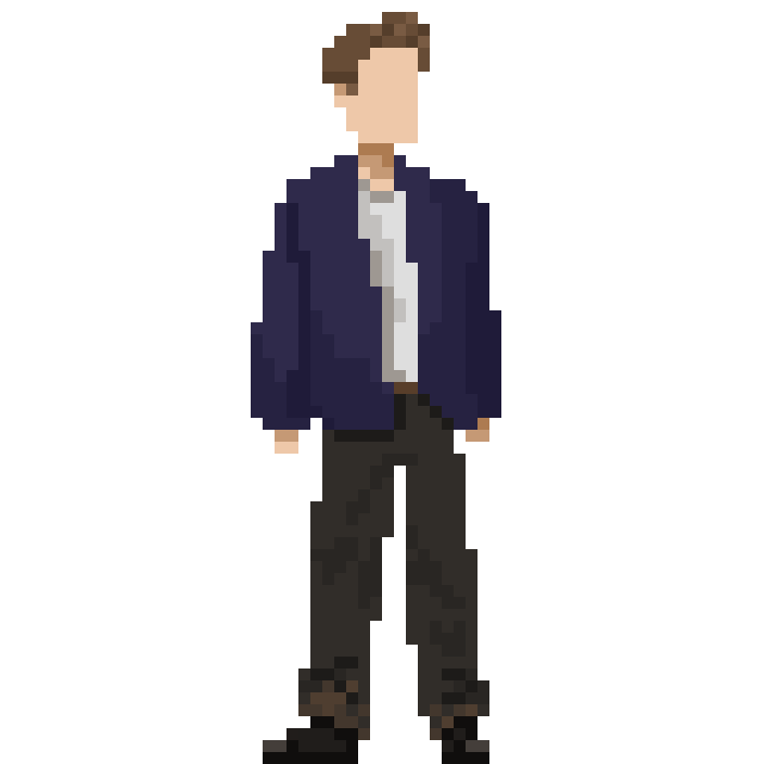
Final design:
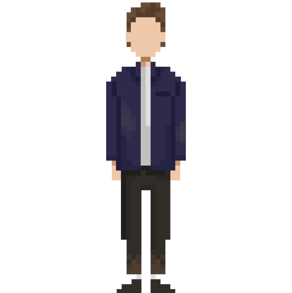
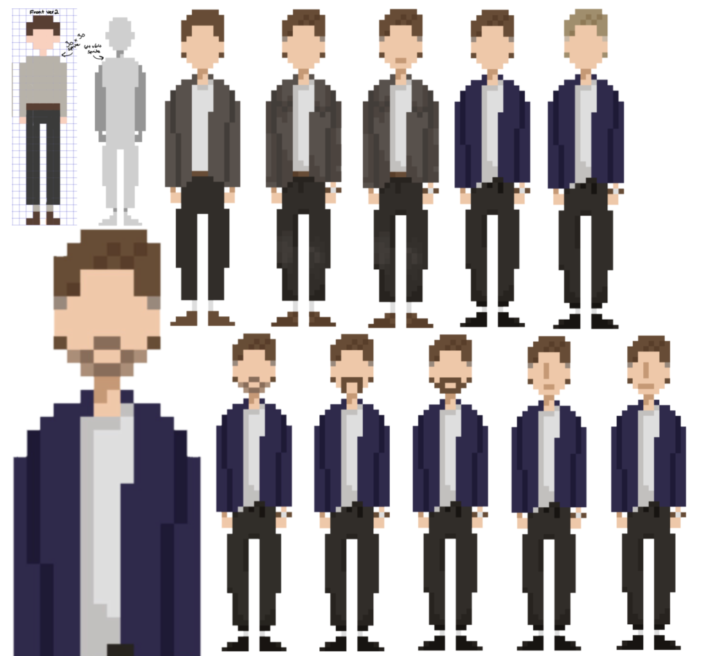
I sent these designs to my team for feedback. They preferred the blue jacket and brown hair look although were torn between the nose line and faceless options. I decided to go with the faceless option to align with my initial concept of allowing the player to project themselves onto him through the faceless design.
This process took slightly longer than I had allocated in my Gannt chart, as I created seven of these designs on the second day. However, I was determined to stay on track, so I moved onto animations.
Animation:
After importing the concept art into the animation software, I made some changes.
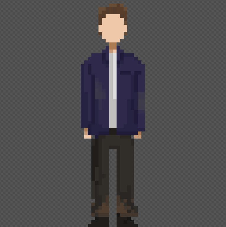
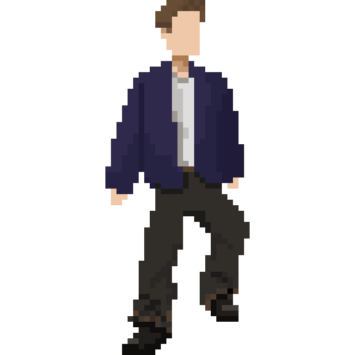
Creating the first frame of the animation allowed me to create a finalised design for the character. I made his jacket wider and longer, his trousers wider and his shoes less pointy. I also added mud to the bottom of his jeans and weathering to his jacket.
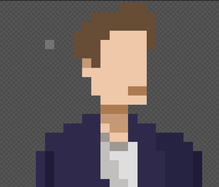
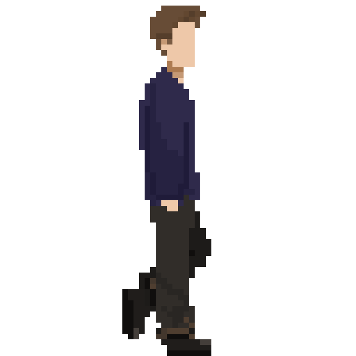
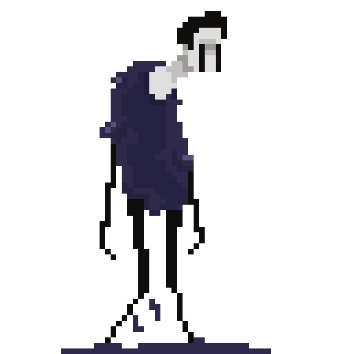
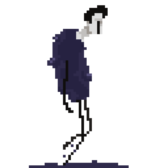
However, after making this first frame, I decided to make the idle sprite at a ¾ view so it would blend more fluidly into the side on walk and run. This time I tried to give him a natural stance since I felt the front-facing sprite seemed rather rigid.
Then I decided to make his face squarer to look more stylised and further experimented with adding facial details, this time eyebrows and a mouth. However, I decided to go with the plain face once again.
I then further exaggerated aspects of his costume such as making the jacket puffier and adding material folds at the bottom of his jeans.
Idle Animation:
Progress:
Final:
With the first frame finalised, I moved onto finishing the animation.
I began by creating the movement in his upper body, animating it as though he were breathing. I created this as a circular motion to exaggerate the action. Exaggeration is a style often used in pixel art to amplify the character’s movement and make them clearer to the viewer (Skaz, 2017).
Then I finished the animation by adding subtle movement to the jean folds and made his hair bounce – these elements gave the animation more life and made it more visually appealing.
Walk Animation:
Progress:
Final:
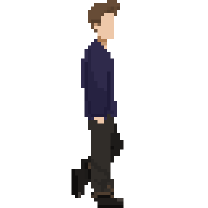
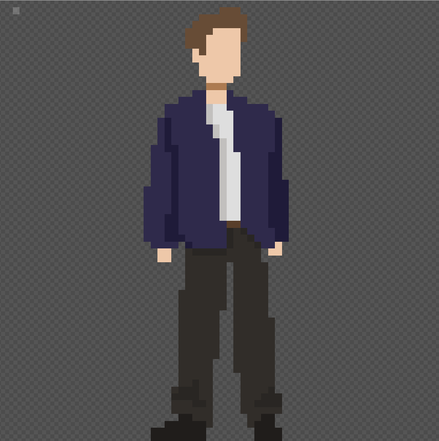
Then I moved onto the walk animation. It had been a while since I’d animated a walk cycle, so this was challenging. I wanted to make the walk look casual, so I could exaggerate aspects of the run to clearly differentiate them. Like the idle animation, I added extra detail with the hair bounce and muddy jeans. Despite the design experiments running into the second day, I still managed to get both the idle and walk animation finished and sent across as originally planned, keeping me on track for the rest of the project.
Run Animation:
Progress:
Final:
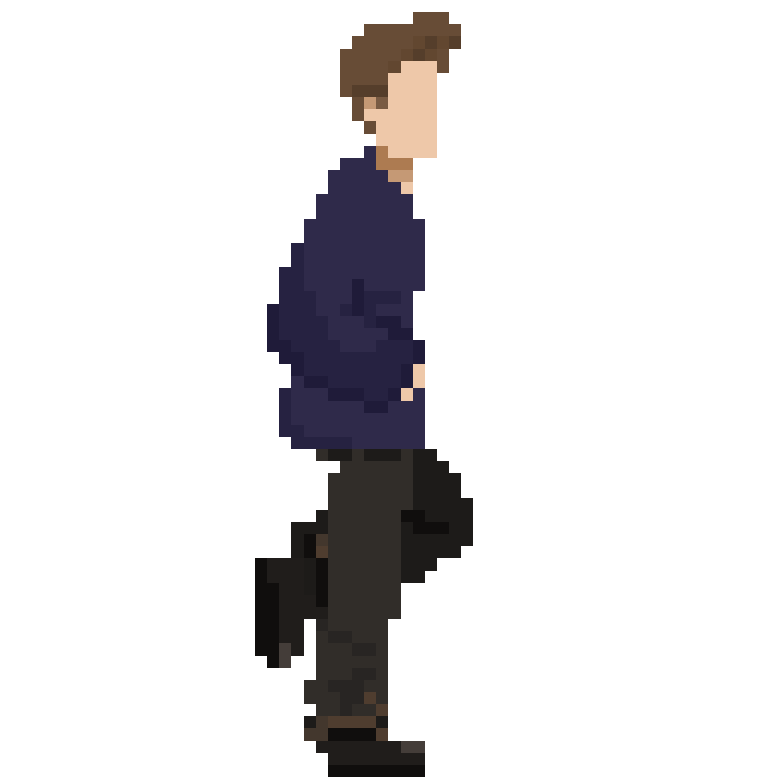
For the run animation, I decided to have the character’s arms bent to convey momentum and to visually differentiate it from the walk. His hair bounces more often and his legs extend further with each stride to, again, give the illusion of more speed.
Jump Animation:
The jump animation was the simplest since it is only three frames: push up, in air and falling.
Overall, I am very happy with these animations. I am glad I decided to step out of my comfort zone and experiment with a smaller sprite size as I feel it allowed me to exaggerate aspects while keeping a recognisably human character. With a smaller sprite size, the details included are very important in both the design and conveying the movement of the actions.
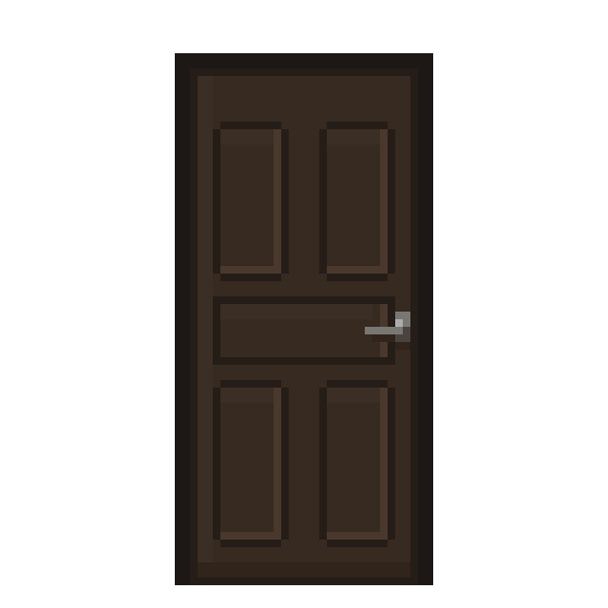
Door Animation:
Then I created a door opening animation for when the player clicked on a room.
Gameplay Mockup:
I made a gameplay mock up video featuring the player and one of Meadow’s monster designs. In the end, this isn’t the gameplay direction we went with, and the game became more of a platformer.
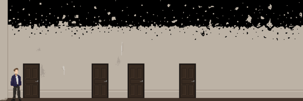
After being told the new direction of the gameplay, I created background sprites for the room.
Background sprites:
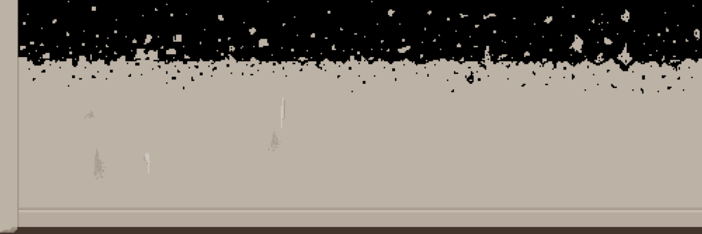
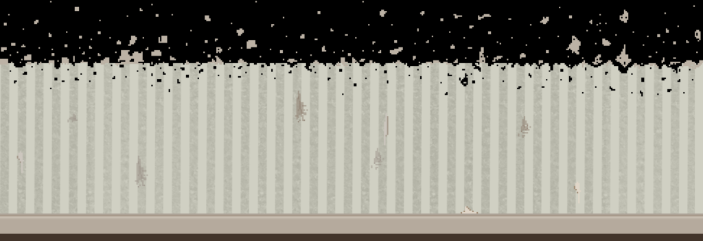
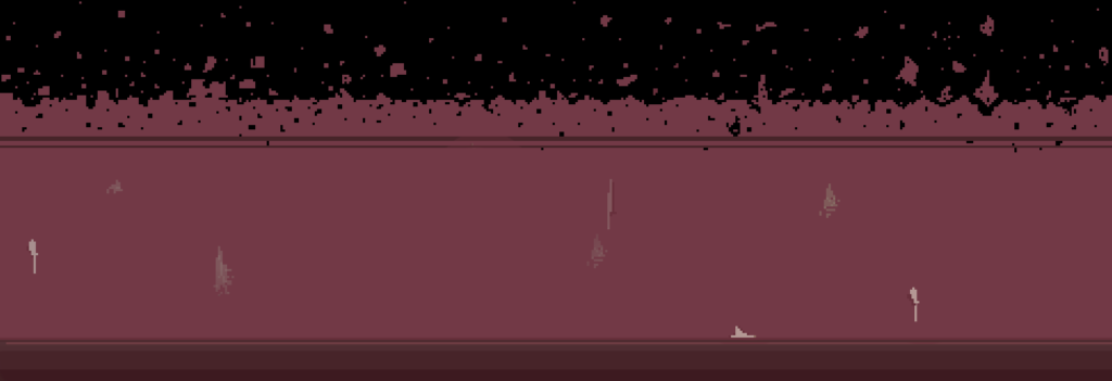
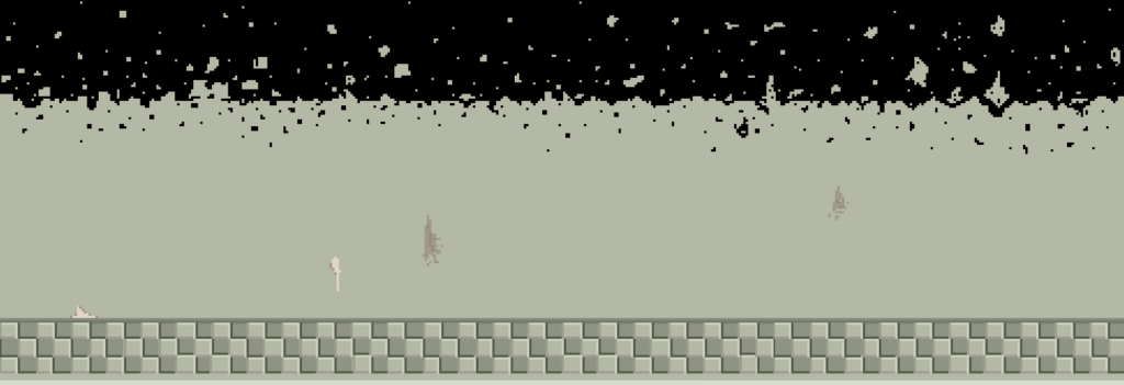
Since it was now a platformer, the ceilings would have to be higher, so I made the walls almost disintegrate and break apart at the top into a black void. I felt this worked well since the game is set in a strange parallel world so design aspects didn’t have to make logical sense and this way Youngju could make the platforming go as high as he wanted. I created background for the ‘level select’ hallway, the bathroom, living room and bedroom since these were the individual stages we wanted to include in each room.
Then I moved onto the final monster design.
Monster Animations:
Since this monster reflects the player, I wanted to predominantly use his blue jacket colour in the design. To accentuate this, I only used black and shades of grey for the rest of the colour pallet. The blue colouring worked well and I designed it with a fluid movement. This flow could be interpreted as tears as this monster represents the player’s remorse.
I would have liked to spend longer developing the concept of this monster, however, this was created towards the end of the project, so I did not have enough time for further experimentation.
I created an idle animation and a walk for this monster.
_____________________________________________
Final Thoughts:
Overall, I feel this project was very successful for my first game jam attempt. Although the final game could not include all of the monster designs we created, it was still a great demo! It is challenging but rewarding and we received positive comments on itch.io from players – many of which complimented the art style.
If we had more time for the project, I would have loved to continue working on this with Youngju and Meadow since I felt we worked well together as a team.
_____________________________________________
If you’d like to play the game, click here: